Customer Reports and Design System
Built a set of reports for our customers, and created a design system to scale for other future reports for new customer personas and partners.

Built a set of reports for our customers, and created a design system to scale for other future reports for new customer personas and partners.

As D-Tools Cloud was launching, we wanted to include a set of reports and dashboards as a differentiator to other products. We also wanted to build a framework for future reports not only for our customers, but also for our partners and industry reports.
Create a set of early reports, and create a design system for these and future reports.
Product Designer and Manager
Database Engineer and Front End Engineer
2018
D-Tools Cloud is a web based SaaS product for System Integrators to manage their sales process by managing opportunities, designing systems through quotes of materials and labor, and sending digital proposals.
.png)
Being a Cloud product, we had the opportunity to collect user data and present it back to them, our partners (customer suppliers), and back to the industry as a whole.
Customer Reports
Add reports to our product for different user types to help customers run a more efficient business.

Partner Reports
Report customer data on partner products, so partners can forecast customer fulfillment needs.

Industry Reports
Present macro-level industry data back to our customers, so they can compare themselves to other businesses like them.
To make our users more efficient in their business, we needed to understand who they where, what they needed, and try and uncover any other areas we could help.
We knew our product was targeted at sales personas, and we knew this included an individual or team of salespeople and a sales manager, typically the business owner.

Description
Steve is a seasoned sales person in the industry who knows enough from a technical standpoint to close deals. He is obsessed with closing and very competitive.
Goals
Close as many deals as possible, stay on top of pending deals, learn how to close more.

Description
Michael owns the business and has hired salespeople to help him close more sales. He closes a few deals himself but has transitioned into managing these salespeople.
Goals
Monitor sales team’s progress, easily see progress across each salesperson, see a forecasted cash flow to make payroll.
Since we already developed our personas, we had an idea about the users needs, but I set out to talk with 6 users of each persona, across both small and medium to large size companies.
What do you need to be more effective in your job?
What are the main reporting metrics you use today? Any you wish you had?
How are you staying on top of opportunities today?
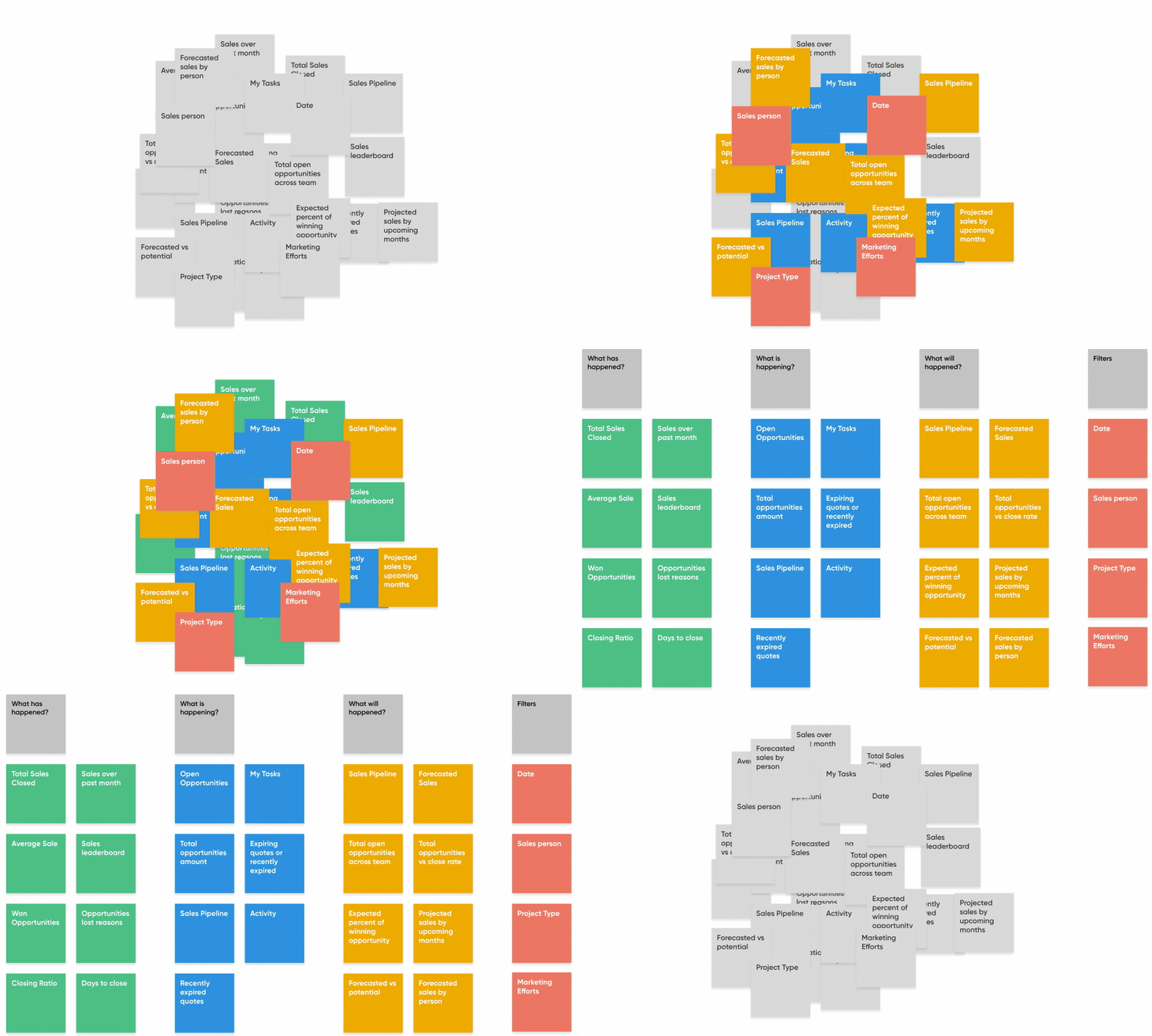
I found the needs were very similar across different company sizes and even very similar between the two personas. After talking with everyone, I organized my notes and ideas of what users asked for and organized based on different report types. I found the reports parts naturally fell into 3 different reports within different filters.

The report metrics the salesperson and manager wanted naturally fell into 3 buckets: past, present, and future. The most important items were the present, and while people said the future was important, they weren’t doing much today to try to get this kind of insight.
What has happened?
What is happening?
What will/may happen?
Starting with sketches and moving to wireframes, I was able to get a feel from internal stakeholders and customers while being able to quickly iterate on the design. I also involved the engineering team at this stage so they can provide feedback, start backend work to support this project, and be along for the journey early on in the design.

Now that I had a good idea of the content in the report and had verified with a user set, it was time to put together a report design system that matched our product style guide.
A few reason we needed to follow a grid was to maintain vertical alignment to lead the user down the page, and to keep the report responsive from a large TV monitor down to a mobile device.

Each report lives in a card which acts as the component. These can slide around the grid template and can even be used on other pages through out the app.


The report molecules are made up of charts and text elements.


Using a common filter pattern, display the filters across the top of the report that can be applied to the numbers below. I made sure to use existing menu molecules, calling out patterns for the engineers.

A report to view what happened. Everything from sales closed, to won opportunities, to sales leaderboard. The filters allow both the sales managers and salespeople to view data across the team or down to the individual across different timeframes.

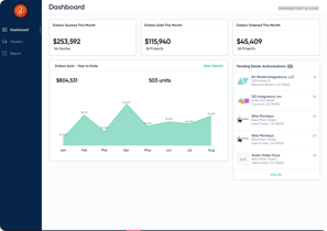
This is the landing page for salespeople and sale managers. This dashboard gives the user the ability to see what they are working on now and can easily access it.

The forecast report is targeted to but not limited to the sales manager to see what the next few months look like. They can narrow down by salesperson, time periods, or opportunity stages.

We were able to create a design system, create 2 reports and 1 dashboard, and we were able to include it as part of the D-Tools Cloud launch. After a few months after launch, we can see the usage of the implemented reports using Mixpanel.
Sales Overview
Report Usage
My Opportunities
Dashboard Usage
Sales Forecast
Report Usage


Start Simple
Originally, we went down a path of purchasing and embedding an expensive 3rd party analytics platform that would allow our users to create ad hoc reports. This was great to work towards, but provided many barriers to launch, slowing down our launch.
Importance of a Design System
With multiple product managers designing their features, the importance of a system showed its value as I could see the variance in the early stages from what I had created and what others had mocked up.
Leverage UI Chart Tools
We used chart.js which made the process of rolling our own reports that much easier.